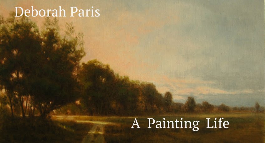
The Pool at Dusk
Oil 20 x 30
After my last post (thanking everyone who responded), I got several emails this past week from people wanting to know what I had discovered on my quest to reproduce the Magic Panel. I got a huge amount of information and some differences of opinion, all of which I appreciate immensely. Right now I am doing my own little R&D project by testing out three different gessos (Artisan, Utrecht, and Art Boards) and Gamblin Ground on hardboard, gatorboard and birch. The plan is to make a bunch of different panels with different grounds and supports, paint on them, then report back.
I've also had several emails over the last few months asking about my palette. I talked a little about that and my technique for doing under paintings followed by layers of transparent color
here. When I started to paint again about 18 years ago (yikes!), I started with a limited palette because that's what my teacher and mentor,
Ned Jacob, used. I stuck with it for a long time and I'm glad I did. Limited palettes are great for teaching you how to mix color and making you focus on the components of color (value, temperature and chroma). As time went by, I modified the limited palette to suit my needs, but pretty much stayed with primaries, ivory black and white. Last year, when I started working in a more indirect manner, using glazes and scumbling, I knew that I needed to address opacity vs transparency, something I'd not ever really thought much about.
I started out by working with the transparent colors that are well known and obvious- ivory black, burnt sienna, sap green, ultramarine blue. I also already had a color called Shale by
Vasari on my palette which is a rich warm transparent dark with a violet undertone. An artist friend suggested I try Indian Yellow - and that was all it took- I was hooked. Wow! what a color!
Where had it been all my life!! What other colors had I been ignoring?!?
A little research quickly led me to
Gamblin. I was already using some of their products (Gamsol, primarily) so I checked out their line of transparent colors. Now many are in my paint box- transparent orange (every bit as wonderful as it sounds), transparent earth yellow, transparent earth red, ultramarine violet, brown pink (delicious!), hansa yellow light, terre verte, olive green and indanthrone blue. I've also added naples yellow, which is opaque, but mixes beautifully with many of these transparent colors.
So that is how I went from three colors to a "joy ride in a paint box"( as Churchill once famously said) .


